My music video can be found here
Tuesday, 5 March 2013
Sunday, 3 March 2013

Tuesday, 29 January 2013
Magazine Advert

This is my finished ancillary product an album release poster. As you can see I have used the photos mentioned in previous posts, however, I have used recoloring to create a standout piece (details of which can be found on the production page) As you can see my ancillary product has a fairly uncluttered design, with the key information in bold colors and subsidiary information such as websites and copyrights and sources of information and purchase in the separate black bar.
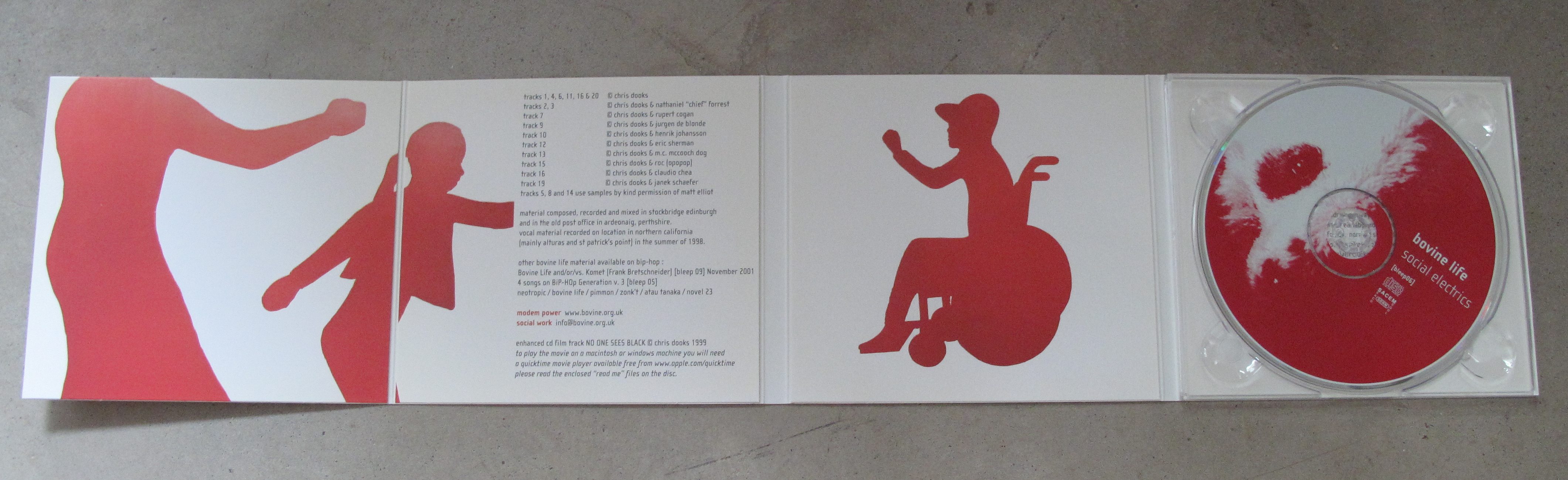
Digipack revision
I have looked at the Digipack again, It was suggested that I address the clarity of the foreword section so I experimented with different fonts and colours. Using photoshop, because of it's ability to show changes on screen without making them I played around with the fonts and colours screen shotting using the grab utility as I went. All I changed was the foreword section to see if I could find a complimentary font to the mistral font used elsewhere. Mistral is the font that I am using to create a portion of the star's identity.


Having looked at some of the possible font options I decided that none were suitable and that Mistral was my best option. Mistral continued the font theme I had through all of my other production pieces. I decided that the issue was mainly a factor of colour. The black text on the sepia background did not work so therefore I set about playing with colours.


The existing colour on my Digipack was black and having decided on mistral as the font I needed to work out how I could lift it off the background and make it clearer and more visible. Therefore I decided to play with the colouring.The original colour was Black and this was blurred and hard to read. Green as shown left is too vivid and would make the digipack look too striking as it contrast the sepia background to much. White blends in too much to the sepia where there is softer lighting and consequently if used on the entire digipack it may appear bland and harder to read. Therefore I decided that a consistent theme of yellow may work. If I lift the text using a drop shadow effect, there will be a soft contrast between the background and the text and thus the digipack will have the right blend of subtlety and clarity.
After this experimentation I have found what i consider to be the best combination of visuals and text for my Digipack. Mistral font which matches.will match my other production pieces combined with sepia instrument backdrops and a yellow font. The structure of my Digipack is the classic single case with room for the CD and another lyric/foreword page with the theme of sepia running inside and out.

Saturday, 26 January 2013
Footage not being used and Outtakes
Here is a brief sample of some of the footage not currently being used within my project in the form of a 5 minute video
I estimate that I have filmed over 4 hours of footage in total. However, I have distilled it into this video. There are some obvious reasons such as orientation that these clips have not been used . However, many of them were not used purely because there was not enough space in the video . Also included is footage that was rejected originally for it being to shaky. I attempted to stabilise it using the built in stabilisation of Imovie but even that did not work and thus the footage was redundant.
Thursday, 24 January 2013
Post Production Ideas
Having filmed the majority of my music video and started post production and collation I have been struck with what I think is a marvelous idea. There are two clear divisions in my piece of music and I wish to highlight this. There is the idea of the river and the park and there is the performance of the piece. Consequently to emphasize the difference I think a post production effect could be used . The effect I have in mind is a black and white. Black and white has several meanings to the audience listed below:
- Semiotic meaning - Link to the past
- Semiotic meaning - Implication of coldness (literal)
- Semiotic meaning - Implication of coldness (spiritual)
- Semiotic meaning - Being Lost
- Semiotic meaning - Destitution
- Semiotic meaning - Boredom ( As evidenced by Wizard of Oz Kansas = black and white Oz = Color)
This idea originally came about from the suggestion that I use some of the built in effects of my camera whilst filming. Meaning I ended up with doubles of every shot, including versions in black and white.
Wednesday, 9 January 2013
New Locations?
Using google maps i followed the the trail of the river past my original location (Beddington Park) After flowing through Beddington park the River (river Wandle) flows through Morden Hall Park where it branches off. This may be another location to film in as it has several branches and looks have some sheltered areas which Beddington Park doesn't. The river's source is also nearby at Carshalton Ponds this may prove to be an asset as it means that most of the river can be tracked in the song and it is just another location in which i can get a variety of shots to use.

Morden Hall is located in the top left of the image with Beddington Park at the base, Carshalton Ponds is labelled by the A. The river is clearly traceable and it is in the open park areas that i feel i will have best chance of obtaining successful shots, due to lighting and the fact that there are bridges and items of interest aside from the river.
Tuesday, 8 January 2013
digipack revision
=

I have decided to edit the digipack before submission. This is because I have decided that it would be easier to create a singular star then an entire band. I change the font to an easier to read mistral font on both the track listing, foreword and front cover to make it easier to read and to make it look slightly more professional. I am still looking for a new image for behind the CD as the current one is not a matching sepia tone and is stretched to fit the template.
Saturday, 5 January 2013
Regarding the 15th December
On the 15th of December I talked about the notions I wished to convey and now entering the post production stage having gathered all my footage. I feel it would be wise to talk about them. One notion I wished to convey was that of the insignificance of the artist compared to greater forces.

I managed to succeed in conveying this notion in the shot above. The artist is shown in full profile in an open space surrounded by large trees. As it is a long shot we can see the entire surrounding and the artist fills only the bottom third of the middle of the shot. This combined with the fact the shot is focused on the artist shows just how insignificant he is to the grand scheme of things.

In my production I also wished to convey the notion of light. In the first shot of the star that the audience sees he is touched by light, implying greater forces, the light grows throughout the piece resulting in the final removal of the black and white effect. (This shot was filmed in both normal and black and white color schemes using the effects contained in the cameras software, the camera is detailed on my production page)
Thursday, 20 December 2012
Accident whilst filming
After trouble sourcing a chalice for some of the shots. I eventually found one. However on the first day of shooting it smashed, as a result of some over-zealous tipping. Consequently I will now have to source another glass or chalice to tip.

Friday, 14 December 2012
Band to star
As mentioned yesterday the band has been dissolved into a star to allow me to focus on the creation of one character. This resolves issues of not having all the members of the band around for shots in the park etc because they live in Nottingham as well as allowing me to be star centric in the video fufilling one of Goodwins conventions. Therefore a drummer will be featured in the piece but he appears as a session musician and not as a fully fledged member of the crew. Once again supporting the image of the star as independent
Thursday, 13 December 2012
Nearing completion

My digipack is nearing completion as you can see i have continued the sepia theme and gone with the trend of track listing on the back. I have added copyright information, producer name and barcode underneath to make the digipack as realistic as possible. I have also implemented a foreword by the lead singer as it seemed appropriate to the bands independent folky image.
Wednesday, 12 December 2012
Digipack Ideas
Having announced my album title via facebook poll and twitter on the stars dedicated pages (see star page on this blog) or follow the twitter link here I have set about thinking about what the album should actually look like. The chosen title was Sepia Masquerade, whose meaning was more cloaked then the other options. However, i feel that there are two interpretations, one being the effect of the past, sepia being the old time photo effect, or secondly the fact that there is a filter clouding our viewpoint. However, I have decided against implementing these interpretations into the album cover instead I have decided to simply play around with Sepia effects on photographs taken from filming the music video. Sepia effects can be applied either directly through the camera I was using or by editing exposure and saturation in post production software such as Photoshop. Here are some of the results of my editing of photos taken in filming locations.


Tuesday, 11 December 2012
Digipacks
Having decided on a band name i could begin work on my digipack. I decided to use a 4 panel template
Research into digipacks:
In a digipack there seems to be a story,here the images flow into one another and characters are introduced encouraging you to flip the pack open.

This Digipack features abstract pictures and gives hints to the themes of the album

Just like the other two digipacks this one features song titles on the pack so that listeners pick it up in the store and know what they are going to buy/get.
On my digipack i intend to use photos i have taken whilst filming. Some of these photos are already in sepia however others need to be edited and this will be performed in photoshop using desaturate and then variations on the red and yellow spectrum
Band Name
I have decided to name the band that my star is in 'Erik and the Eagle'. It is an unusual name but i think it has an alliterative ring and conjures ideas of affinity to nature but also power. It is also not overtly religious meaning that the band can will not automatically be stereotyped and therefore can release into the mainstream charts as bands such as Red and Switchfoot have done
Error/Need to reshoot
On trying to create the finished product I have realised that a large proportion of my footage has been spoilt by being too shaky or in the wrong orientation. This mainly applies to the park footage by the river and should therefore be easy to reshoot using a dolly. Footage of the church in Nottingham may be slightly harder to reshoot given distances therefore I am currently experimenting with ways to counteract the problem.
Saturday, 8 December 2012
Set Design
In advance to filming I have been sent this image detailing the current set up of the stage and asking whether there would be any need to alter it.

It is my plan to strip the stage back to the minimum requirements in order to create the impression that the performance is almost ad-hoc and in order to reduce clutter in the shot. Therefore I have asked for only the microphones, drum box and guitars be left out.

It is my plan to strip the stage back to the minimum requirements in order to create the impression that the performance is almost ad-hoc and in order to reduce clutter in the shot. Therefore I have asked for only the microphones, drum box and guitars be left out.
Friday, 7 December 2012
Locations

One of the main locations is the church/come stage that the star performs on and for this I have chosen The Betel Of Britain Church in Nottingham. Pictured Left is the windows behind the stage which make an industrial but church like feel whilst also providing the light required for the filming.

as shown on the left there is a stage which I can use, the chairs and the aisle might subsequently be changed for practical and aesthetic reasons and this applies to what appears on stage. But this is the sort of feel that i will try to achieve from my video

Also present is a drum box, which could prove useful as it will mean that i can relate the visuals to the lyrics and sound. I could also use it to give a recording studio style feel, of each instrument being recorded separately. Not shown is the mixing desk which i could use to add to this feeling of a recording studio.

The location also has a balcony which will prove useful for shots with some height and angle. The picture in question was taken from this balcony and gives a sense of the depth of the building.

This particular shot shows the light that flows through the building, with most of the light originating from the windows at the back of the stage.

I have chosen the location for the river which is another key feature of my video. Beddington Park has the River Wandle flowing through it and because the river winds and the park is fairly large there are many places i can film key scenes from. Picture here is the most open part of the river and one of the locations for a river scene.

I have chosen to film the river in the early morning due to the way that the cuts across it and lights it. Filming it in this light shows the river up really well and also prevents dog walkers and members of the public getting in the way

As I mentioned above the river has many different 'feels' and places to film from. Pictured here is where it runs into the lake and this may be a suitable location for some of the chorus lines as the water is slower and the area more serene.

The river also has numerous trees and furniture such as bridges on its banks, this gives the opportunity of pausing for verses and musical interludes and getting shots like the one pictured left.
Thursday, 6 December 2012
Album name
I have come up with a total of three suitable album titles that reflect the artist's Christian genre as well as having the witty catchy ring of album titles
- Angel management
- Sepia masquerade
- Experimental exaltations
I conducted a poll with the star's following on Facebook to engage the fans and grow the star's following (evidence of which can be found on the star page )
Decision on Alternate Ideas for music video
I have been considering the lines where there could be alternate symbols for a few days now and I have come to some decisions. The idea of the paper boats as a symbol appeals to me and from conversations I have had the feedback has tended to favor them over literal displayed waves from an oscilloscope.
However, after taking advice on the meaning of the line 'there is a tree that marks the places you've been ' I have decided that unless I can generate shots of an actual cross then there is no point of having a shot other than that of performance as the following line is going to be one of religious connotation. With the spilled chalice. Consequently at present it looks like I will stick with performance shots rather than synonyms.
Tuesday, 4 December 2012
Alternate ideas for music video
The line there is a tree that marks the places you've been, has proved to be hard to script and produce due to its ambiguity. I thought that I had found a possible location for my original idea of writing on the tree but on examining this idea again I questioned whether a random scene with a tree fitted with the rest of my production. Consequently, I had a rethink on what tree could mean/ represent and whilst searching for a location in which to film my library/ globe scene I thought about Family Trees. These documents are sometimes found in such locations and consequently the idea of a tree marking the places you've been fits in quite well. Therefore my plan could be to have a narrative in which a family tree is drawn up over time throughout the piece of work, with the tree growing every time the line repeats with the tree revealed at the end of the song, as before.
Another development in my thinking has been to used the River more within my piece. I thought this would be possible using paper boats for the line 'to control the waves that empty out your life' To me this seems more befitting of the song than an oscilloscope whilst also allowing me to utilize the beautiful Terracotta bridge I found when scouting locations in the park. It also allows me to create a running image throughout my piece. By filming the boat being put in and travelling and then running into the rapids also at the park I can effectively, kill two birds with one stone showing the line 'I know the world can turn in different ways' showing the boats disintegration and destruction by the rapids.
Monday, 3 December 2012
Beginning work on Ancillary Poster
I am beginning work on my ancillary poster having decided on imagery to use. I have a few ideas on album titles ( these make up another post), a clear idea of the font I wish to use and a clear theme. I want my poster to be noticeable for the background image being a stunning photo from my filming locations with the wording forming a secondary part of the image that is not initially noticeable. I am aware that this is a rejection of the previous ideas using the unique brush/smudge background i had created. However I feel clear pictures are more effective in production pieces rather than block colors Shown below is a snapshot of the base images I believe i can use to construct this poster.


Hopefully I will be able to combine these pictures to make something that resembles the key aspects of the star. I hope to be able to implement the picture of the guitar into the image of the surroundings, however this may require some recoloring due to different light conditions. The main background shot might even need to be lightened. However, at the moment this is speculation as I have not placed the two items together in photoshop as of yet.
Wednesday, 28 November 2012
Decision regarding ancillary poster product made
After some time considering the best route forward and playing around on Photoshop I have come to a decision regarding my ancillary products. I have decide that the best route forward would be to create an album release poster, publicizing the debut song as the lead song on the album. I came to this decision as it publicizes the star firstly and secondly it seemed the most logical step for a new artist. As I am trying to create the impression that my star is new and upcoming it would not make sense to announce a headlining tour without a catalogue of music to play.
Sunday, 25 November 2012
Indecision
I am still undecided on whether I should create a tour poster or an album release advert. Therefore I quickly knocked up drafts based around the same brush then smudge effect background to see which format I liked most, hence the previous two posts.
Saturday, 24 November 2012
Potential Magazine spread

In order to promote the album release/tour start i have created a magazine page double spread.My plan is to use a simple approach with just the main details. As i have no concrete ideas for my stars persona and name i have just placed in symbols
Friday, 23 November 2012
Mock Poster

In order to meet the brief, a double page magazine piece must be created to advertise the album release or tour. Consequently i've made a mock-up advert using photoshop. The background effect was made by layering gradients and then using a leaf shaped brush to smudge them together. On top of this I added a singer's silhouette by overlaying a colour over the picture and blurring it using an opacity brush.
Thursday, 22 November 2012
Tour Posters/Album adverts
I have decided that one of my ancillary pieces will be a poster to promote a tour or to promote an album. The poster is required to be a double page spread so A3 dimensions (420 x 297 mm) will be the template I will use in Photoshop. In order to ensure that there is sufficient margin spacing and that words do not blend into the crease between pages I will use the template found here as a background layer, working with text and photos on layers on top of it.To successfully create a magazine poster I thought it would be best to brainstorm some ideas and examine existing products to identify any tropes/trends/conventions.


Tour Poster Examples:


Tour posters seem to have a few items in common, firstly they all feature the artist heavily. Usually this is through a picture, however some above feature just the artists name in large font. Secondly, All of the posters above also feature a tour name, even if it is a simple as the north american tour, I'd speculate on this being a sales mechanism to herald the unique nature of these performances. Thirdly and perhaps most importantly all these posters have a unique distinct visual style. This can stem from the design of an album as in Bon Jovi's case, the tour poster reflects the album cover pictured here or it can be intertextual like oasis pop-art reference or it can be a simple colour alteration such as Jars of Clay's sepia effect for their shelter tour poster.
Album Release Examples:


Album release posters were harder to find and I think this is logical. To publicize an album or single an artist has to already have had success or be guaranteed successful sales. Consequently, album release posters seem to largely center around second or third albums. Of course there are examples of debut album posters around however in today's modern music industry posters are rarely used. Instead we see promotion on music websites or services like Itunes and especially around peak buying times ( Christmas ,Valentines and Mother's day) TV adverts for albums. A good example of how the music industry has changed in regards to advertising is VEVO. VEVO is a video sharing company that has the licensing of EMI,Sony Music Entertainment and Universal sharing their artist's videos and selling merchandise. Consequently for official videos on Youtube the VEVO service has a monopoly and in order to fund its dominance VEVO advertises new releases on all its videos. Consequently the record companies are directly targeting those interested in music videos at a lower cost then a printed campaign. Therefore printed album release and single release posters have become a luxury , illustrated by the dates of some of the releases on the posters. However, this does not mean that I cannot use them as an ancillary product. Targeting specific consumers using a magazine is still common and consequently using a poster in CCM magazine may actually be more effective method of transmitting news about my star, as the genre is still very niche and therefore targeting the grassroots seems more logical then targeting the whole music crowd which is costly.
Subscribe to:
Posts (Atom)